TUNESTA
✕ Designing a Music App ✕
OVERVIEW
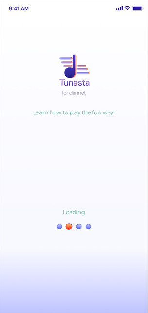
"Tunesta" is a music app designed for the education and training of the jazz clarinet. It is a music player and sheet music provider combined and uses “gamification” and social techniques to encourage and engage kids to discover more about the clarinet. The app also includes audio examples.
"Tunesta" is a music app with a difference. It is an educational learning tool that challenges the sometimes, monotonous task of learning and education by adding a more interactive approach.
Some competitor analysis I conducted used apps such as “Yousician”, “Tomplay” and “Tonestro for Clarinet” as examples.
COMPETITOR ANALYSIS

Tomplay
Visibility of Systems - clearly explains to the user what is happening and what they will be able to do on the app.
Regular Rhythm - Using image and text to create balance and rhythm.
Invariance - Icons show invariance. They are simplified versions of objects but are still easily recognizable.

Emergence - Learning starts as one small task and leads off into more tasks to unlock and learn as you scroll down
Emphasis - Uses a bold colour contrast to emphasize what is hi-lighted
Help and Documentation - Popups to help you navigate through the app
Yousician


Tonestro - For Clarinet
Similarity - makes sure to keep all sections looking the same and consistent to group them, while changing colour to hi-light the differences.
Unity - Uses Bold complimentary colours throughout to differentiate and organizes each section to look the be sympathetic to each other.
Flexibility and Efficiency - Allows you to choose your own username and also what instrument to customize.

KEY FUNCTIONS + DESIGN PATTERNS


Looking closely at the current apps out there for educational training, I began to create my mood board, fonts and iconography for the app.
DESIGN

After looking at the competition I decided to use some of their techniques and ideas and adapt them to my own app.
I made sure to have a login page for onboarding as well as having help and FAQs for anyone struggling with the app.
I have clear navigational elements with text to make sure there is no confusion for the user. The icons and colours are simple and fun and are aimed to engage a young audience.
LOW FIDELITY

After spending time researching and testing my app design pages, I began to build a mid fidelity version. I kept the designs fairly simple and made sure to add text where necessary for explanations.


